7 Amazon Mobile Conversion Mistakes Costing You Sales
Most sellers still build and review their Amazon listings on a desktop. The problem is that a listing that looks polished on a large monitor can become difficult to scan inside the Amazon Shopping app.
That gap is where sales quietly disappear. Sessions increase, clicks look healthy, and ordered units barely move. You check the listing on your desktop, and everything appears clean, but the mobile experience tells a different story.
This guide breaks down the Amazon mobile conversion mistakes that reduce sales, how to identify them on your own listings, and which fixes to prioritize first. For a broader diagnosis, read our guide on why your Amazon listing is not converting. This article focuses specifically on the mobile shopping experience.
Is mobile where you’re losing sales?
Table of Contents
Why Amazon Listings Perform Differently on Mobile
Most sellers think of their listing as one fixed page. In reality, shoppers experience the same product page differently depending on their device, screen size, and whether they use the Amazon Shopping app or a browser.
Mobile Shoppers Make Faster Decisions
Let’s say you sell protein powder on Amazon. A shopper searches on their phone, scans several results within seconds, and taps the listing that communicates the product and its main benefit fastest. That is the environment your listing must compete in.
The Amazon Shopping app adds another layer that many sellers fail to test. Titles may truncate, images appear smaller, and A+ Content modules stack vertically in ways that are difficult to judge from a desktop preview alone.
What "Looks Fine on Desktop" Actually Means on a Phone
A listing that looks polished on a 27-inch monitor can hide a title that cuts off mid-sentence, an infographic that becomes unreadable, and important product information buried deep in the page. You may not notice these problems until you open the listing on an actual phone.
Quick Tip. Before changing your copy, open the listing in both the Amazon Shopping app and a mobile browser. Review it as a customer would, starting from the search results rather than opening the product page directly.
The 7 Mistakes Breaking Your Mobile Conversions
Most Amazon mobile conversion mistakes fall into seven common categories. You do not need all seven problems to be present. Usually, one or two weaknesses are causing most of the damage.
Your Title Hides the Main Selling Point
According to Amazon’s official Seller Central announcement, product titles in all categories except media must stay within 75 characters, including spaces, starting July 27, 2026. The update is designed to help titles display fully on mobile, making every word more important.
Use the opening words to identify the product and communicate its strongest differentiator. Include purchase-critical details such as flavor, size, quantity, or compatibility where relevant. Use Amazon’s Item Highlights field for details such as materials or recommended use cases instead of overloading the title.
Your Main Image Fails at Thumbnail Size
Your main image must remain clear both on the product page and as a small search-result thumbnail. A compliant image can still look weak if the product occupies too little of the frame or the packaging details are difficult to recognize.
Review the image at thumbnail size beside competing listings. If the product type, quantity, or package format is unclear at a glance, shoppers may scroll past before reading the title.
Your Bullet Points Become a Wall of Text
Long bullet points may look manageable on a wide desktop screen but become dense paragraphs on mobile. Shoppers scanning on a phone are unlikely to work through several lines before discovering the main benefit.
Use benefit-first bullets with short sentences and a clear message near the beginning. Avoid feature-heavy paragraphs that force the reader to search for the reason the feature matters.
Quick Tip: Read each bullet aloud while viewing it on your phone. If the main benefit does not become clear within the first sentence, rewrite the opening.
Your A+ Content Becomes Hard to Read
A+ Content designed on a wide desktop screen can become difficult to scan when its modules stack vertically on mobile. Dense image text, overloaded banners, and wide comparison charts can lose their impact on a smaller screen.
If your brand is eligible to publish A+ Content, check every module on an actual phone before submission. Give each module one clear purpose and make sure its main message can be understood without zooming.
Your Variations and Pack Sizes Create Confusion
Variation choices become more difficult to compare on a smaller screen. Unclear flavor names, inconsistent pack-size labels, and images that do not match the selected option can make shoppers question what they are actually buying.
Use simple variation names and keep size, quantity, flavor, and serving information consistent across the title, images, bullets, and variation menu. Test every option on mobile to confirm that the correct image and offer appear after selection.
Your First Three Images Miss the Main Objections
Mobile shoppers often swipe through images before reading the full bullet section. If your strongest proof, size explanation, or use-case image appears near the end of the gallery, many shoppers may never see it.
Use the first three images to answer the most important buying questions. Show what the product is, its main benefit, and a purchase-critical detail such as size, quantity, compatibility, ingredients, or what is included.
Your PPC Message Does Not Match the Mobile Listing
Sometimes the listing is not the only problem. The mismatch between the shopper’s search and the first mobile screen can also reduce conversion.
Let’s say your campaign targets “low sugar protein powder,” but the title and first images only focus on muscle growth. The shopper clicks with one expectation and lands on a page that emphasizes something else. You may see healthy clicks but weak orders, causing the advertising campaign to take the blame for a message-alignment problem.
If ad spend keeps increasing without matching sales growth, pair this audit with our guide on structuring Amazon PPC for profit.
Identifying these issues takes more than reviewing the listing design. ScaleA2Z evaluates listing performance and PPC data together, helping brands determine whether weak conversion is due to mobile content, traffic quality, or a combination of both.
The Five-Minute Phone Test You Should Run Today
You do not need an expensive tool for this test. Start with your phone, the Amazon Shopping app, and five uninterrupted minutes.
What to Check in the First Five Seconds
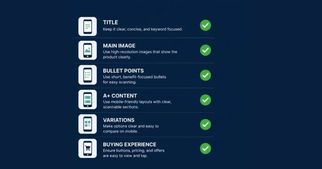
Open your listing in the Amazon Shopping app and give yourself five seconds. Can you identify the product, its main benefit, and the quantity or size being offered? If the answer is no, a shopper may leave before reading the rest of the page.
What to Check While Scrolling
Keep scrolling and note every place where you need to pinch, zoom, or squint. Check the first three images, infographic readability, bullet length, variation clarity, pack-size information, and whether the A+ Content remains easy to scan.
Quick Tip: Repeat the test on multiple devices when possible. Different screen sizes can reveal cropping, spacing, and readability problems that may not appear on a single phone.
A Before-and-After Mobile Listing Example
The difference between a desktop-friendly listing and a mobile-friendly one becomes clearer when you examine a real product example.
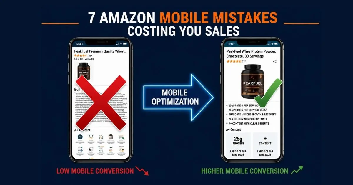
Let’s say you sell chocolate whey protein powder with 25 grams of protein per serving and 30 servings in each container.
The Weak Mobile Version
The original title begins with repeated brand wording and broad phrases such as premium quality, advanced formula, and fitness support. The product type, flavor, protein amount, and serving count appear near the end.
The main image shows the container with too much empty white space, making the product look smaller than competing listings. The second image includes six icons, a long paragraph, and several claims that become difficult to read on a phone.
The first bullet discusses the manufacturing process but does not explain why the product is relevant to the shopper. The serving count appears only in the fourth image and near the end of the title.
A mobile shopper has to work too hard to answer basic questions.
- What is the product?
- How much protein does it provide?
- How many servings are included?
- What makes it different from competing options?
The Improved Mobile Version
A clearer title could read as follows.
PeakFuel Whey Protein Powder, Chocolate, 25g Protein, 30 Servings
The opening identifies the product, flavor, main nutritional differentiator, and quantity without unnecessary filler. The main image allows the container to occupy more of the available frame while remaining compliant with Amazon’s image requirements. The second image communicates one message.
25g Protein Per Serving
The third image shows the container, scoop, serving size, and 30-serving quantity. A later image can explain flavor, mixing instructions, ingredients, or other relevant benefits. The first bullet starts with the shopper benefit rather than the production process.
25G PROTEIN PER SERVING
Support your daily protein intake with a whey formula that provides 25 grams of protein in each serving and mixes easily with water or milk. This version does not rely on more content. It improves conversion by presenting the most useful information earlier and making each element easier to scan on a phone.
Quick Tip: Do not redesign the entire listing before identifying the main leak. A stronger title opening and clearer first three images may create more impact than adding another A+ Content banner.
Fixing Mobile Leaks in the Right Order
Once you identify these Amazon mobile conversion mistakes, fix them in the order in which shoppers experience the listing. Changing lower-page content first will not solve a weak search result or unclear first impression.
- Improve the title opening: Make the product type, differentiator, and purchase-critical details clear without forcing the shopper to read the full title.
- Test the main image at thumbnail size: Compare it with the leading organic and sponsored listings for your main keyword. Check whether the product, packaging, and quantity remain easy to recognize.
- Reorder the first three images: Use them to explain the main benefit, product size, quantity, use case, or the concern that appears most often in customer reviews.
- Rewrite bullets for mobile readability: Use benefit-first openings, shorter sentences, and one clear idea per bullet.
- Simplify A+ Content: Remove small image text, overloaded banners, and wide charts that become difficult to scan on mobile.
- Check variations and offer clarity: Confirm that the selected option, image, size, quantity, and price describe the same product.
- Review listing and PPC data separately: Use Business Reports to compare Mobile App and Browser performance where that breakdown is available. Then review PPC search terms separately to determine whether weak conversion comes from the listing, irrelevant traffic, or both. Our guide on why your Amazon listing isn’t converting covers how to isolate a traffic problem from a page problem.
How to Measure Whether Your Mobile Fixes Worked
Every Amazon mobile conversion mistake shows up differently in your data. A listing may look better after an update without performing better, which is why every mobile optimization decision needs a baseline and a measurement period.
Before changing the title, images, bullets, or A+ Content, record the following metrics.
- Sessions
- Ordered units
- Unit Session Percentage
- Advertising clicks
- Advertising orders
- Advertising conversion rate
- Click-through rate
- Return reasons
- Mobile App and Browser performance where available
Use the same date range before and after the change whenever possible. Avoid comparing a normal week with a major promotion, stock shortage, holiday period, or price change.
Low Click-Through Rate
A low click-through rate often points to a search-stage problem.
Review the following elements first
- Main image
- Title opening
- Price
- Review rating
- Coupon or promotion
- Relevance to the search term
Do not rewrite the full A+ Content when shoppers are not opening the listing.
Healthy Clicks but Weak Unit Session Percentage
If shoppers open the listing but do not order, the problem is more likely to exist on the product page.
Review these elements first
- First three images
- Variation clarity
- Pack size and quantity
- Bullet readability
- Review objections
- Offer competitiveness
- A+ Content readability
Weak PPC Conversion but Stable Overall Conversion
This pattern may indicate a traffic-quality problem rather than a universal listing problem.
Review the search terms generating clicks. Determine whether they match the product’s use case, size, flavor, audience, or main benefit. Then check whether the first mobile screen confirms the same promise made by the keyword and advertisement.
High Returns After Conversion Improves
A higher conversion rate is not always a positive result if returns also increase. Rising returns may mean the listing persuades shoppers but sets the wrong expectations.
Review size, quantity, compatibility, ingredients, product limitations, and what is included in the package.
For eligible brands, use Amazon Manage Your Experiments to test alternative titles, images, bullets, descriptions, and A+ Content. Change one major element at a time unless you intentionally run a multi-attribute experiment. This makes it easier to understand what produced the result.
How Long Mobile Listing Fixes Need to Show Results
Title and main-image changes can influence click-through rate and early conversion signals sooner because shoppers see them before opening the full listing. Bullet points and A+ Content changes may require a longer evaluation period because they affect shoppers later in the buying journey.
Do not call a mobile fix a win or a loss after only a handful of sessions. Give the change enough traffic to produce meaningful data, and account for pricing, promotions, inventory availability, advertising changes, and seasonality when comparing results.
According to Amazon Seller Central, Unit Session Percentage is a core ASIN-level conversion metric because it compares ordered units with listing sessions. Track it alongside sessions, ordered units, click-through rate, and advertising conversion rate to understand whether your mobile fixes are improving performance.
When to Fix It Yourself vs Bring in a Partner
A title revision, image-sequence change, or bullet rewrite may be manageable for a single ASIN. The process becomes harder when Mobile App and Browser performance differ, PPC spend keeps increasing without matching sales, or multiple listings need to be diagnosed at the same time.
That is where an experienced account-management team can add value. A one-time audit may identify visible problems, but ongoing analysis is needed to connect listing changes, search-term quality, bids, inventory, and conversion trends.
Fix Mobile Conversion Leaks Before Buying More Traffic
Your product page may contain the same information on desktop and mobile, but shoppers do not experience that information in the same way. A weak title opening, an unclear thumbnail, a confusing variation, or an unreadable A+ module can reduce conversion before the shopper reaches your strongest selling points.
Run the five-minute phone test this week. If you identify two or more of these Amazon mobile conversion mistakes, fix the earliest problem in the shopping journey before increasing traffic or advertising spend.
Think your listing might be losing sales on mobile?
Frequently Asked Questions
Why does my Amazon listing convert worse on mobile than desktop?
A mobile listing may convert poorly when the title hides important information, the main image loses clarity at thumbnail size, bullet points become difficult to scan, or A+ Content contains unreadable text. These are some of the most common Amazon mobile conversion mistakes, and reviewing the complete mobile journey helps before assuming that price or PPC is the only problem.
How can I tell whether mobile shoppers are causing the conversion drop?
Compare Mobile App and Browser data in Business Reports where available. Review sessions, ordered units, and Unit Session Percentage across similar periods. Then examine PPC search terms separately to determine whether the issue comes from the page, the traffic, or both.
What is the fastest mobile fix for a low-converting listing?
Start with the title opening and main image because shoppers see them before opening the product page. If click-through rate is healthy but Unit Session Percentage remains weak, review the first three images, variation clarity, bullets, and offer presentation.
Does the Amazon Shopping app display listings differently from a mobile browser?
The same listing may appear differently because screen size, page layout, title display, and module stacking can vary. Test the listing in both the Amazon Shopping app and a mobile browser rather than relying only on the desktop preview.
Can A+ Content reduce mobile conversion when designed poorly?
A+ Content can become difficult to use when image text is too small, modules contain too much information, or comparison charts require zooming. Each module should communicate one clear message and remain readable on a phone without pinching or zooming.
Should I measure mobile and browser conversion separately?
Yes, where Amazon provides the breakdown. A blended conversion rate can hide weak Mobile App performance when Browser conversion remains strong. Use device data as one diagnostic layer and interpret it alongside PPC traffic, pricing, inventory, and listing changes.
Can I A/B test Amazon listing content?
Eligible brands can use Amazon Manage Your Experiments to test content such as product titles, images, bullet points, descriptions, and A+ Content. Testing is more reliable than choosing a design only because it looks better to your internal team.